Meicon
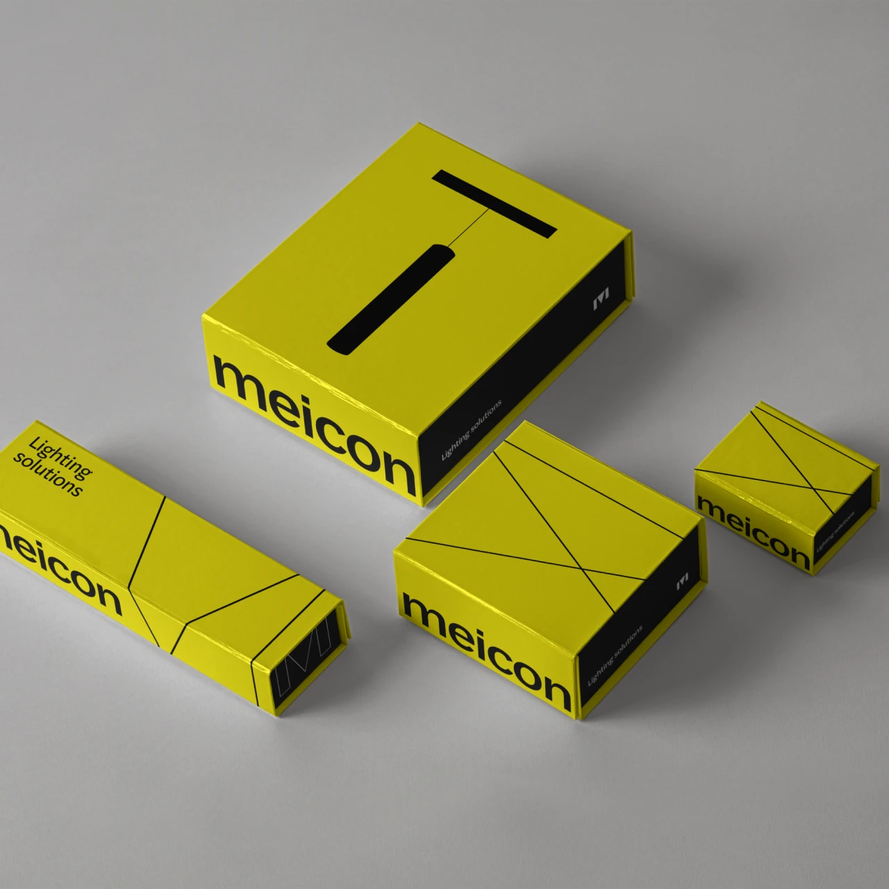
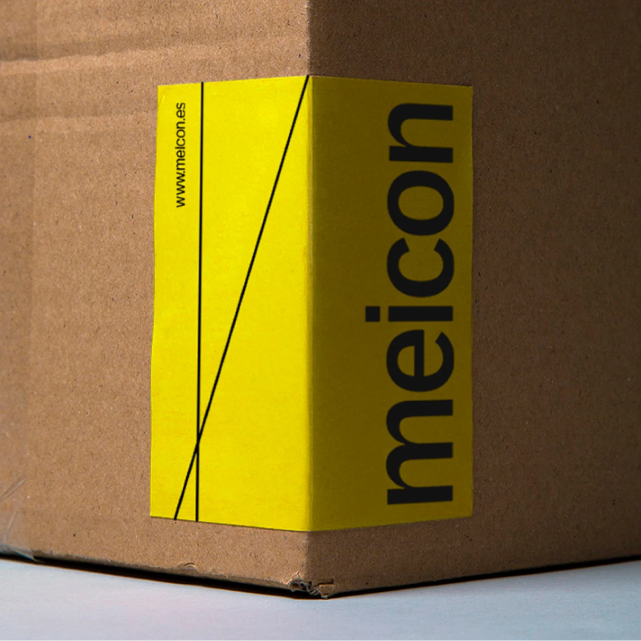
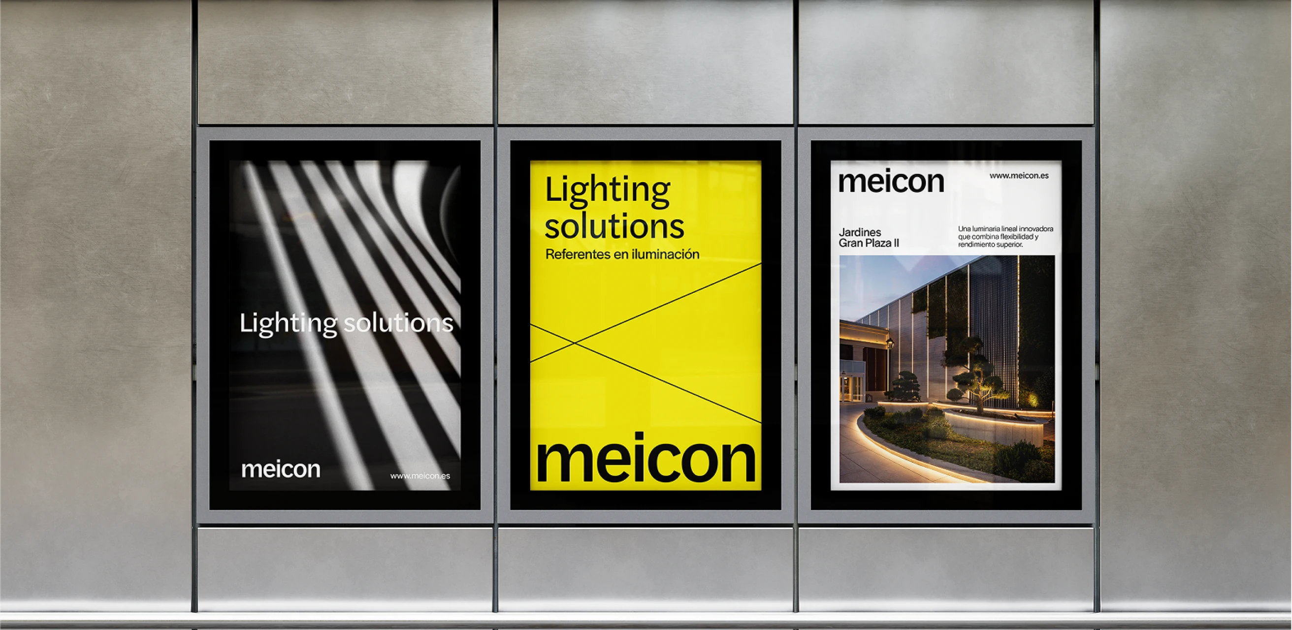
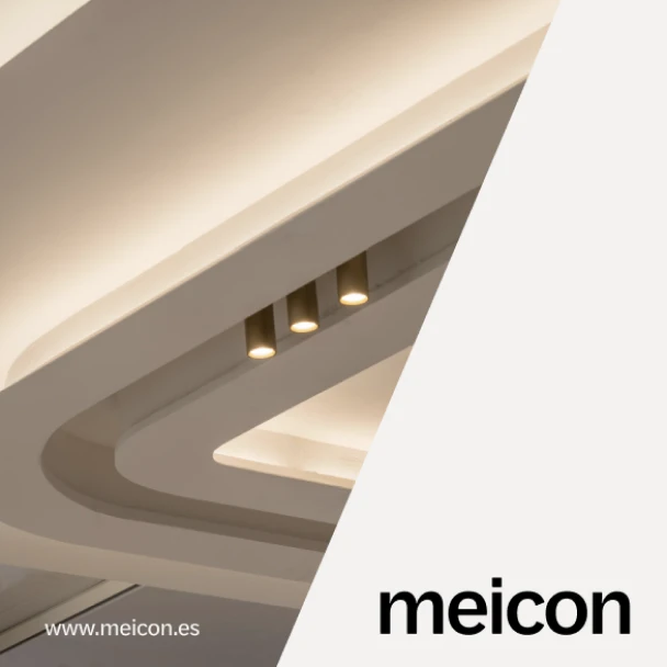
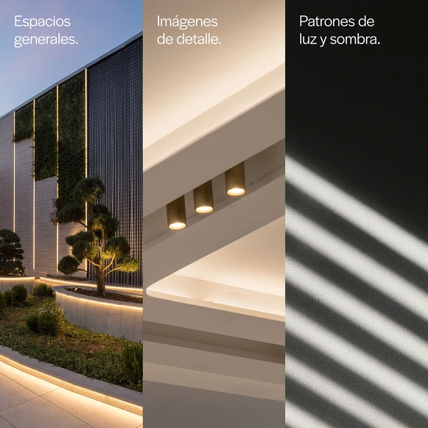
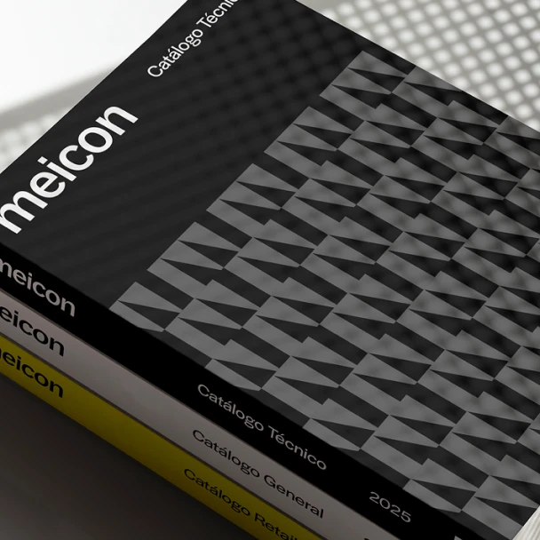
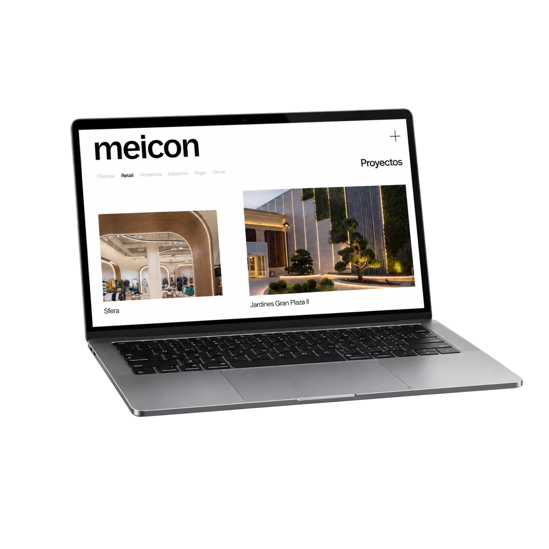
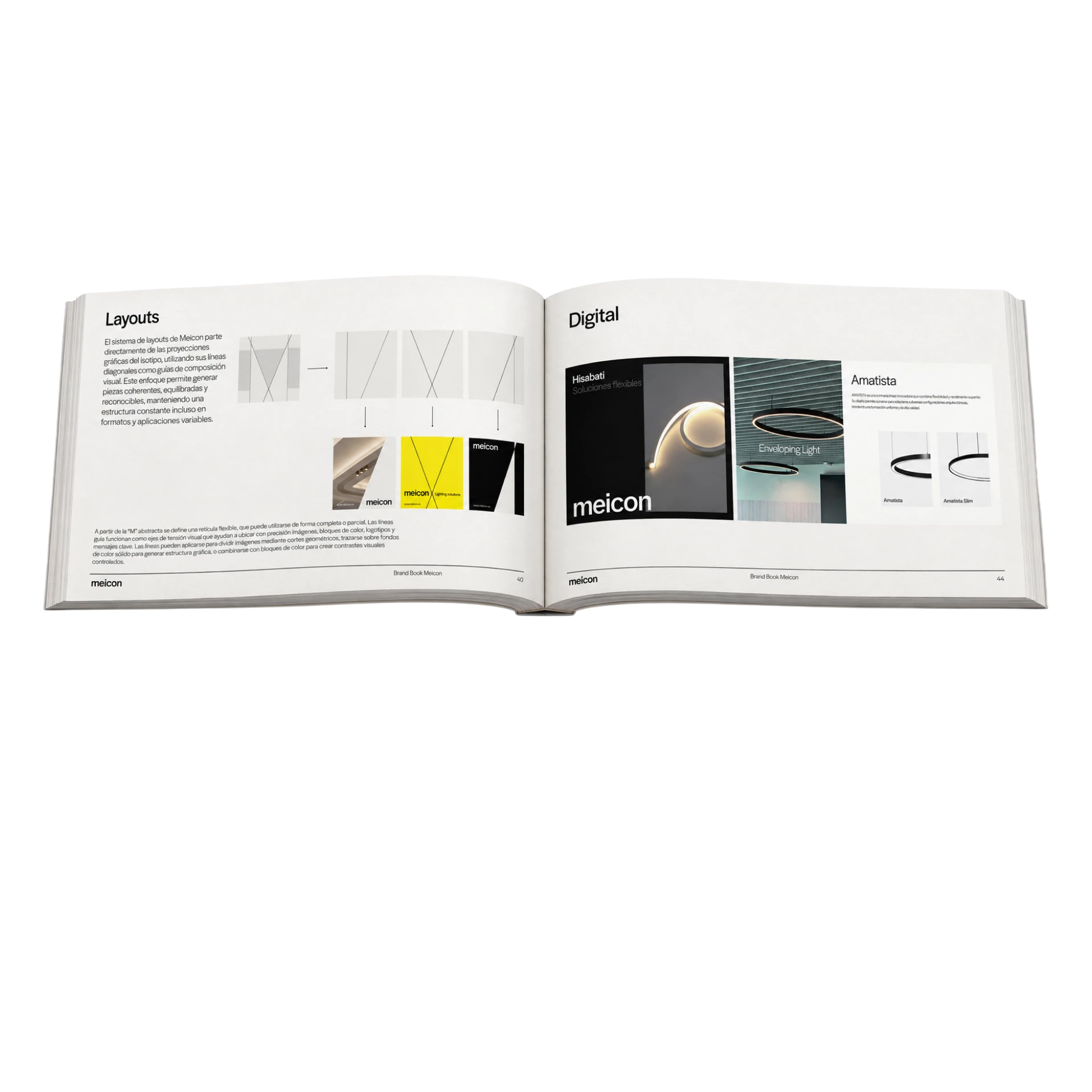
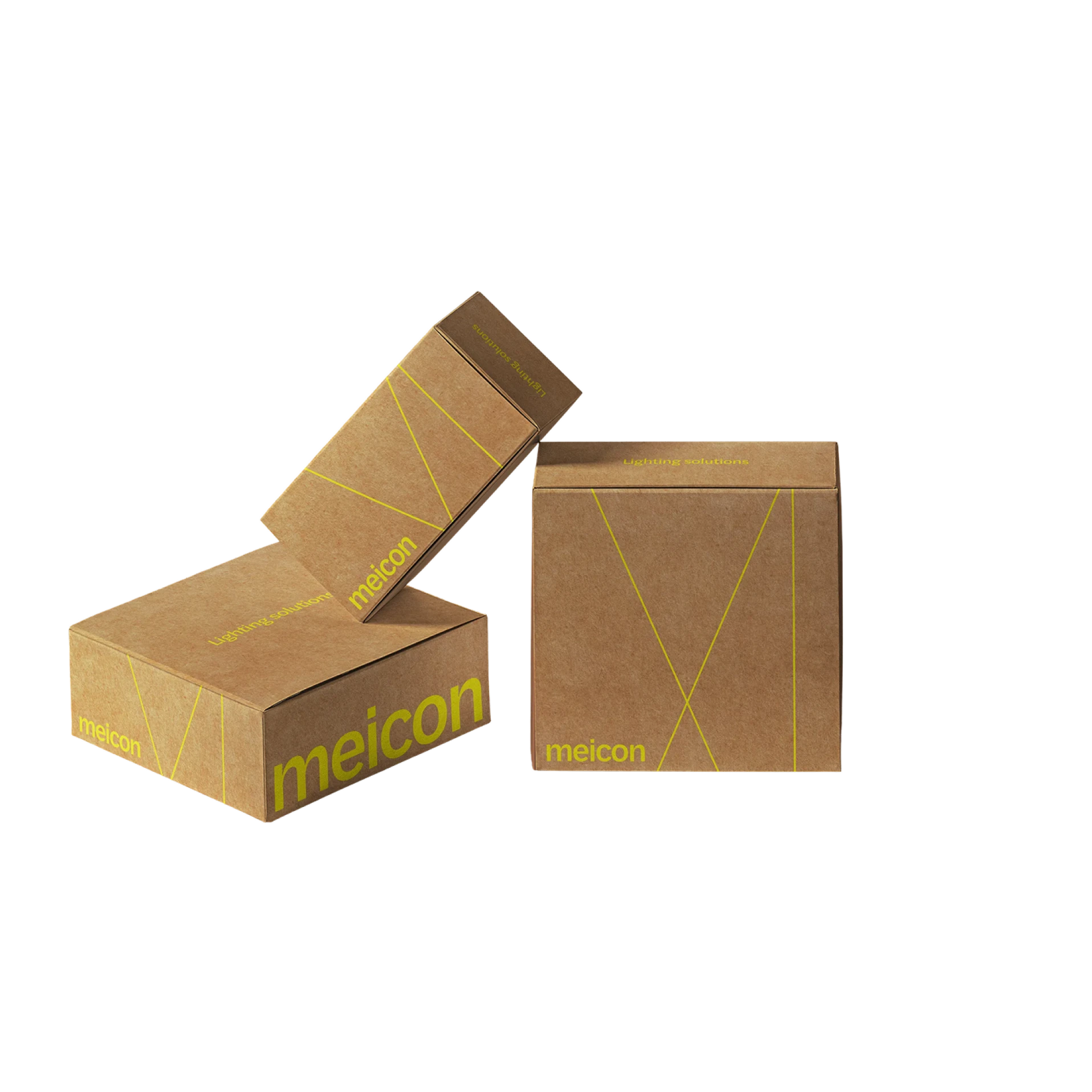
Meicon had spent a decade engineering light — but its brand still looked industrial, catalog-grade, invisible next to the architecture it illuminated. VRANDED Studio repositioned the company around a sharper idea: work from the shadows, let the light do the talking. The new isotype distills two crossing beams into a single, abstract "M" — precise where Meicon is technical, quiet where the product needs the spotlight. Getting there took a real second pass: an early mark that read beautifully on screen fractured under laser engraving, so we rebuilt it stroke by stroke until it held its shape on any surface, at any size. What shipped is a full identity system — logotype, palette, packaging, merchandising — built to stand beside architects, not behind them.
Brand assets
Packaging
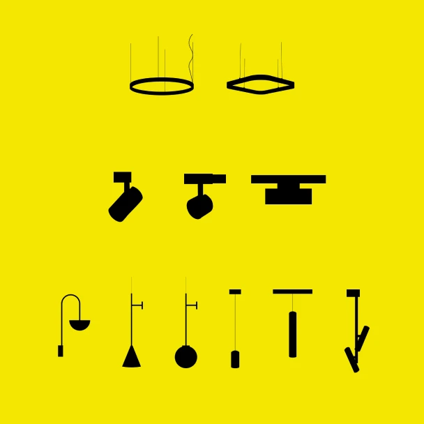
Assets
Materials
Let's build your brand together
You've spent enough time thinking about it. Drop your details and we'll take it from here.